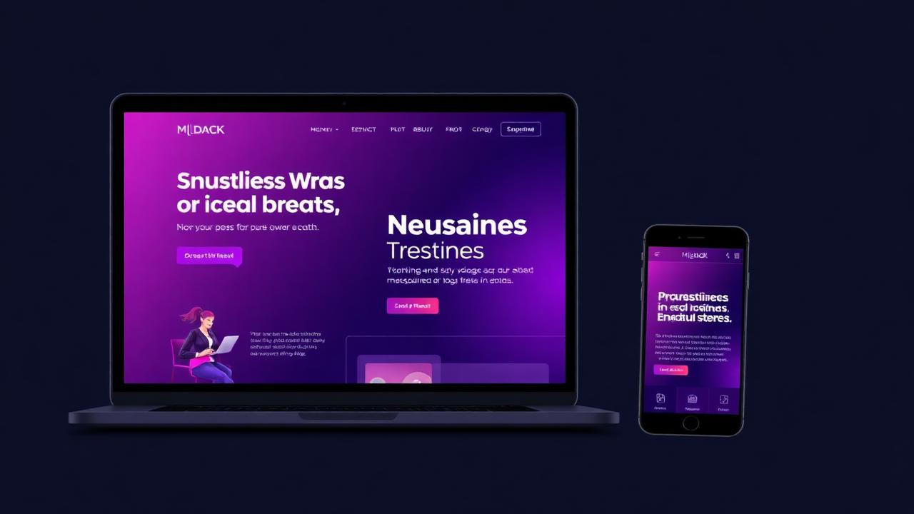
Why Your Calgary Business Needs a Mobile-First Website

Mobile devices now account for 60% of all website traffic, and that number continues to grow. For Calgary businesses, having a mobile-first website isn't just a nice-to-have. it's essential for survival in today's digital marketplace.
The Mobile-First Reality
Google now uses mobile-first indexing, meaning it primarily uses the mobile version of your site for ranking and indexing. If your site isn't mobile-optimized, you're essentially invisible to the majority of potential customers searching for Calgary businesses.
Speed Matters More Than Ever
Mobile users expect pages to load in under 3 seconds. Every second of delay can result in a 7% reduction in conversions. Optimize images, leverage browser caching, and minimize code to ensure lightning-fast load times on mobile devices.
Touch-Friendly Design
Buttons and links must be large enough for fingers to tap easily (minimum 44x44 pixels). Ensure adequate spacing between interactive elements to prevent accidental clicks. Mobile users should never need to zoom to interact with your site.
Simplified Navigation
Desktop navigation doesn't translate well to mobile. Use hamburger menus, sticky navigation, and clear calls-to-action. Calgary businesses that simplify mobile navigation see up to 50% increase in conversion rates.
Optimize Forms for Mobile
Long forms kill mobile conversions. Request only essential information, use autofill attributes, and implement appropriate keyboard types (numeric for phone numbers, email for email addresses). Every field removed increases completion rates.
Readable Typography
Mobile screens are small, so typography must be clear and legible. Use minimum 16px font size for body text, ensure sufficient line spacing, and maintain strong contrast between text and background. Never make users pinch to zoom to read content.
Mobile-Specific Features
Leverage mobile capabilities like click-to-call buttons, location services for directions, and mobile payment options. These features reduce friction and make it easier for customers to take action.
Test Across Devices
Your site must work flawlessly across all mobile devices. iPhone, Android, tablets, and different screen sizes. Regular testing ensures consistency and catches issues before customers do.
Progressive Web App Capabilities
Consider implementing PWA features like offline functionality, push notifications, and home screen installation. These app-like features enhance user experience without requiring a native app.
The Business Impact
Calgary businesses with mobile-optimized websites see higher search rankings, increased traffic, better engagement, and significantly more conversions. In a mobile-first world, your website must deliver an exceptional experience on small screens. or risk losing customers to competitors who do.
Need a mobile-first website for your Calgary business? Our web development team builds responsive sites that convert. Also check out our local SEO tips to drive more traffic to your new site.